How to apply visual devices such as the RAC intersecting beams and graphics
Our logo
Our logo embodies RAC's three brand values
- Lead the charge
- Always moving
- Empower the people
All logos can be requested from RAC's Creative Services team by contacting creativeservices@rac.com.au
Helpful tips
- Use the portrait version of the RAC logo where possible.
- Wherever possible the RAC logo should appear with the tagline.
- The tagline can be omitted if there are space restrictions/issues with prior approval from the Brand team.
- If logo is used on RAC yellow, use the saturated version with the glow (ie. TVC endframes).
- The logo exclusion zone must be applied.
- Our logo, tagline or a business unit name should never change or be recreated under any circumstance.
- Where possible the logo should not appear multiple times in the browser window.
| Preferred layout | Alternative layout | |
| Preferred logo use |
 Minimum size: 50px X 50px
|

Can be applied in horizontal formats.
Minimum size: 100px X 43px
|
| Limited use |
Maximum size: 49px X 43px
Minimum size: 22px X 19px
|

Two colour variation - for use in gif images
|
| Exclusion zone | 
This is the minimum amount of white space required around the logo shown as the height of the RAC "R".
Within a digital application the top and bottom can be half an "R" (as shown above) although a full "R" is prefered if possible.
|
 |
| RAC business unit logos |
Minimum size: 80px high
|
Minimum size: 80px high
|
Example of when logo is not legible:
.png?h=145&w=628&modified=20180514004604&hash=16AA25DF4E569A542EFACA2DDACD461F)
RAC intersecting beams
The intersecting beams are a key part of the RAC visual language. The sweeping edges and angles of the logo have directly inspired our extended visual language. The "intersecting beams" alludes to roads, beams of light, forward movement, modernity and the WA landscape.Helpful tips
- The intersecting beams should be used where possible within any artwork produced
- They should not be used repeatedly
- There will be situations where they don’t work- so don’t use them!
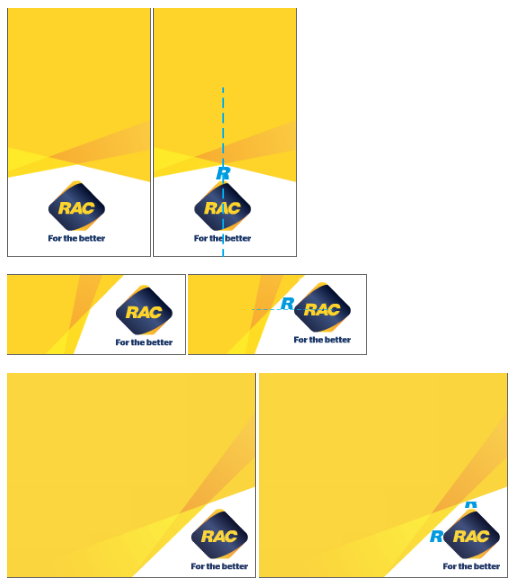
- Ideally the intersecting beams should be positioned at the bottom of any artwork with a white area below the beams where the logo is positioned/sits
- There are some variations approved for specific use, such as flash banners and the RAC website. These are the only authorised variations to the intersecting beams and should not be applied to any other collateral or artwork
- Do not rotate or distort the intersecting beams
- The highest point of the logo aligns with the highest point of the white space (see below for example)
- All four sections of the beams must be visible when used and are designed to run off the page as shown below
Acceptable variations for digital
Graphics
All existing graphics can be requested from RAC’s Creative Services team by contacting creativeservices@rac.com.auVarious graphics may be created whilst adhering to the graphic element principals. These are not icons and are larger in appearance to represent items such as infographics or breakouts. Additional brand colours may be used to create graphics but used minimally to add small details or highlights.
Graphics must be designed flat, simple and stylised without using tints, shading, outlines or 3D in appearance. They should also be rounded/smooth in appearance to compliment the straight lines of the rays.



Note
Offline icons have been removed from digital standards as they are now defined/stylised as graphics within the digital space. All other icons are defined as computer icons which can be found under the navigation section.
Shadows
The use of shadows is restricted within digital applications as it limits space and adds unnecessary depth.
