Our website and templates should be easy to get around. Organising content, layout and providing clear and intuitive navigational aids are essential to provide a straightforward structure that will enable the user to find information easily.
Navigation elements form part of our visual and cognitive language. They are used to guide visitors in a simple and structured way thanks to the clever use of existing conventions, simple layouts, use of brand colours and fonts.
Call to action buttons
Our button CTAs are based on Bootstrap.
Primary action Secondary action Alternate button
- Do not use the primary style on a yellow background, use the alternate button instead and vice versa
- Try to minimize the count of primary CTAs visible on the screen at any one time
<a> element with the classes
.btn and either .btn-primary, .btn-default or
.btn-scondary.
Button sizes
You may also like larger or smaller buttons, to increase or reduce the emphasis or certain elements.
Large button Large button Large button
Normal button Normal button Normal button
Small button Small button Small button
For developers using out style sheet: To do this add .btn-lg,
.btn-sm, or .btn-xs for additional sizes.
Chevron button
To be used when:
- Button is part of a multi-step process e.g. Register form
- When pressing the button will cause the user to change contexts (leave what they are currently doing).
- In eDMs
- For all Digital Banners
Not to be used when:
- Button has an icon
Icon button
Buttons are also able to include an icon, this should be used sparingly and never on a chevron button.
Other coloured buttons
There are also a range of other bootstrap button variants, however these are to be used sparingly, such as in forms.
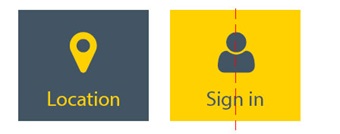
Square navigation items
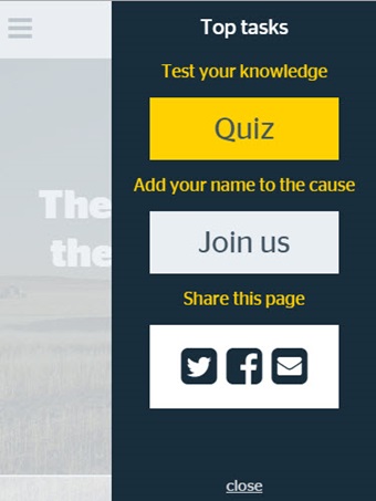
These are effectively buttons with square edges but to avoid confusion we call them navigation items. These are used when the user must select between multiple options on a navigation page (i.e. a page listing various subpages). The example below is the top tasks menu on the elephant in the wheatbelt microsite.
- Corners are sharp with no rounded corners
- Text and icons are always center aligned
- Can be square or rectangular in shape
- Square icons have icon or graphic center aligned above text
- Can be icon only (especially useful for mobile layouts)
- Text can sit below square but must center aligned
- Where possible buttons should highlight yellow when user hovers over the item
- Not to be used for a single stand alone button
- Not to be used in conjuction or in close proximity with rounded buttons
- Text should always be in the Stag sans book font
- Text should be no longer than 4 words or 24 characters


Circular buttons
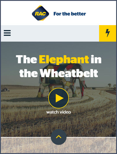
From time to time there maybe a need for a circular button or indicator. The main use for this is a play button for a video, but may also be used as an indicator to scroll or as a or as a suble video playhead on a video thumbnail.
- Contains only one icon center aligned
- short description of the action (no more than 15 character) can appear below the button
- Buttons should stand out clearly, should be either yellow or deepest diesel with yellow border

