The photography principles listed in the Brand Standards apply for digital design – please refer to these for more information.
Responsive page banners guide
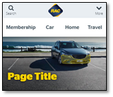
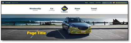
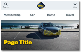
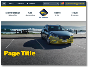
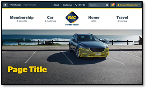
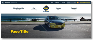
Images for our website are automatically cropped from a 16x5 aspect ratio based on the size of the users device. As such images must be shot wide so that when cropped they do not loose important key parts of the image.
|
Phone - small
|
Desktop - wide
|
To be considered when shooting
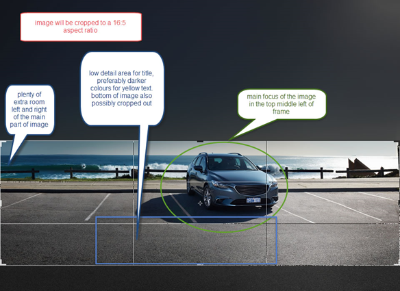
- The 16 x 5 crop ratio
- Room left, right, and bottom third which might be cropped out automatically
- Focus of the image to sit in the top/middle-right section of the crop
- Low details in the middle-left part of the image for the title (flat colours ideal)
Cropping considerations
More examples of responsive sizes and automatic cropping
|
phone - large
|
tablet - portrait (i.e. ipad)
|
|
tablet - landscape
|
laptop - small
|
|
desktop - superwide
|
|
